Phoenix Ukraine

Phoenix Ukraine is a non-profit organization with a goal to help legalizing psychedelic medicine in Ukraine to facilitate the healing process from war-related trauma on a large scale.

Phoenix Ukraine

Phoenix Ukraine is a non-profit organization with a goal to help legalizing psychedelic medicine in Ukraine to facilitate the healing process from war-related trauma on a large scale.

Marketting Website

Overview

As a pro bono endeavor, I had the privilege of designing and building the website for Phoenix Ukraine, a non-profit organization that collaborates closely with other impactful organizations like Upra and Heal Ukraine Trauma. The website serves as their online presence, enabling them to share their mission with potential supporters and providing a seamless platform to accept donations, fostering greater engagement and support for their cause.

Problem Space

Phoenix Ukraine faced a critical challenge: they lacked an independent online presence, hindering their ability to share their inspiring mission and engage potential supporters for fundraising. By crafting a captivating website, we aimed to bridge this gap and propel their mission forward.

"We need to ensure that visitors can easily understand who we are and what we do."

"I want visual elements to be strong but not dramatic. Instead, I want them to be sincere, capturing the essence of Ukraine and its people."

"I want visitors to clearly understand how the raised funds will be allocated."

"The website should have a modern and legitimate appearance that enhances our overall credibility."

"We aim to emphasize the evidence-based nature of our approach. it would be nice to showcase the effectiveness of psychedelic-assisted therapy through brief research evidence."

"We need to make sure it's simple for people to donate."

RESEARCH

Research

Interview Insights

To kickstart my process, I conducted an interview with Olga Chernoloz, the founder of Phoenix Ukraine. I aimed to delve into her visionary perspective, uncover the organization's goals, and gain insights on the desired branding and voice for the website. By understanding her vision firsthand, I could ensure the website design aligned seamlessly with the organization's objectives and effectively communicated their mission to the target audience. Here are a few of the major insights from our call:

"We aim to emphasize the evidence-based nature of our approach. it would be nice to showcase the effectiveness of psychedelic-assisted therapy through brief research evidence."

"We need to make sure it's simple for people to donate."

"We need to ensure that visitors can easily understand who we are and what we do."

"I want visual elements to be strong but not dramatic. Instead, I want them to be sincere, capturing the essence of Ukraine and its people."

"The website should have a modern and legitimate appearance that enhances our overall credibility."

"I want visitors to clearly understand how the raised funds will be allocated."

Brand Attributes & Mission Statement

As a next step Olga and I did a brief and focused branding exercise to shape the influential presence of Phoenix Ukraine. By diving deep into this discussion, we refined our vision, leading to a concise mission statement and a genuine grasp of the brand's voice. These insights drove our strategic choices for the website's copy and visually engaging elements. I started with asking Olga several questions and offered a list of potential answers to choose from


Culture: How would our community describe us?
Target Groups: How would we describe our target audience?
Voice: How do we want to sound to others?
Feeling: How do others feel after being in contact with us?

Site map

Approaching the information architecture process as a puzzle solving, I began by capturing all the necessary sections on post-it notes, each serving a distinct function or addressing a specific need. By drawing insights from my proto-personas and finding from a research on websites of other non-profit organizations, I continuously rearranged the pieces until they seamlessly formed a cohesive story flow.By prioritizing clear information presentation and intuitive navigation, my objective was to captivate visitors, foster meaningful engagement, and facilitate effortless interactions at every stage.

Culture:

Compassionate

Trustworthy

Collaborative

Progressive

Professional

Empowering

Nurturing

Influential


Target Group:

Volunteers

Collaborating Organizations

Media & Press

General Public

Philanthropists

Donors

Activists

Government Entities

Scientists

Voice:

Inspirational

Authentic

Proactive

Collaborative

Results-driven

Engaging

Optimistic

Accessible

Innovative

Knowledgeable

Educational

Feeling:

Supported

United

Inspired

Encouraged

Connected

Heard

Motivated

Informed

Encouraged

Confident

Uplifted

Involved

Mission Statement: "Legalizing psychedelic medicine in Ukraine to facilitate the healing process from war-related trauma on a large scale."

Comparative Research

Next, I delved deep into the world of diverse non-profit websites, carefully examining their design and functionality. This in-depth comparative research allowed me to uncover the tried-and-true patterns and essential elements that underpin an exceptional user experience. By synthesizing these valuable insights, I acquired a comprehensive understanding of the strategies that truly work and selected the must-have components to integrate into Phoenix Ukraine's website.

Low-fi site structure

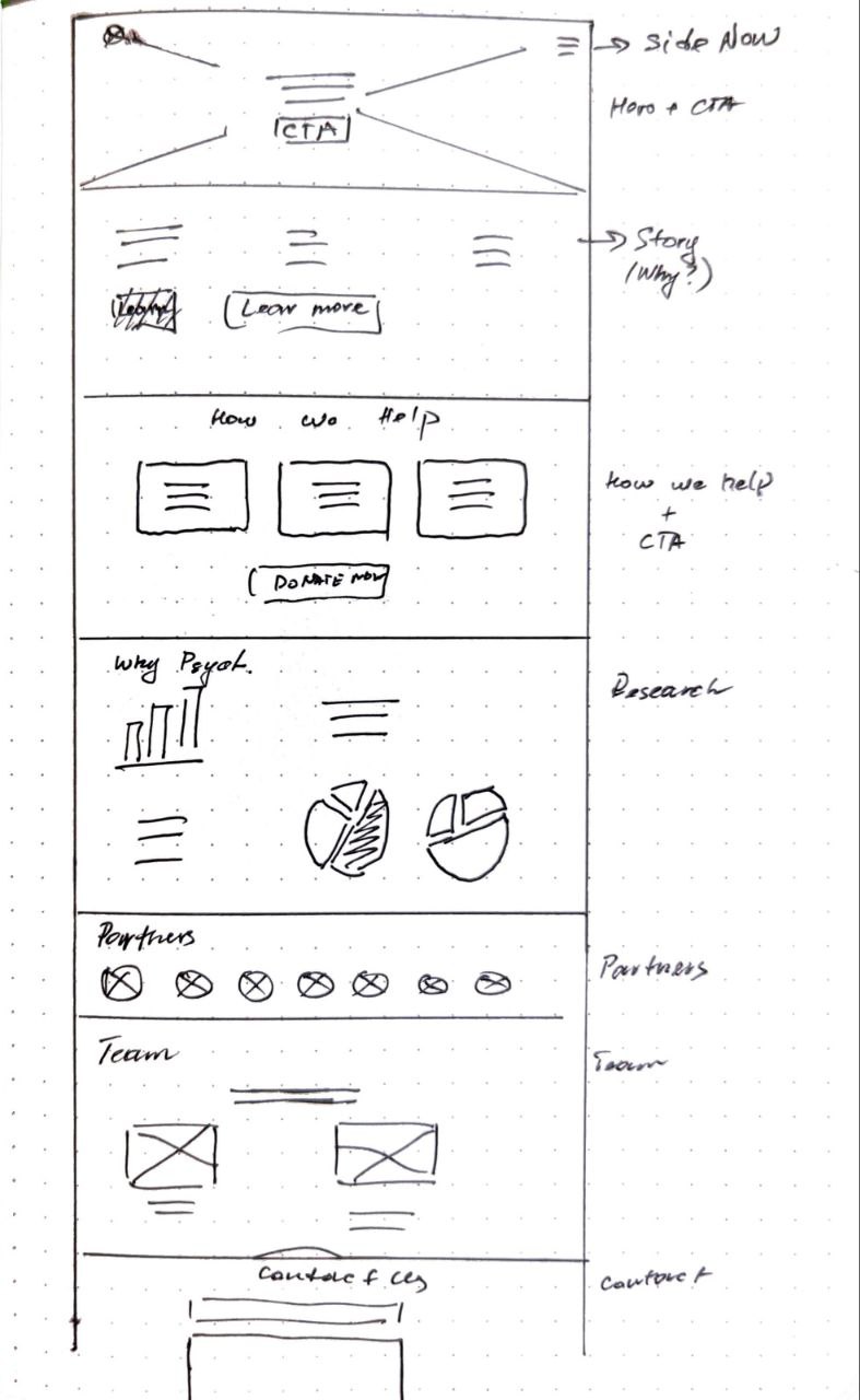
After exploring different flow combinations, I sketched out a few that I like the most for a better visual understanding. Out of all the options, I found that flow #1 had the most cohesive and intuitive structure. It just felt right for our visitors and their needs.

Main Goals

Finally, I wanted to syntesyse all of my learnings and findings and set very clear and simple goals that I have for the website:

  • Clear Communication of Purpose: effectively communicate the organization's purpose, mission, and impact.

  • Seamless Donation and Engagement: design a user-friendly donation process with a simplified form, multiple payment options, and single/recurring donation choices. Reassure users about the security and impact of their donations.

  • Contact Us: make it easy for visitors to connect with the non-profit's team.

  • Transparent Use of Funds: provide a clear explanation of how the funds will be utilized.

  • Fact-Supported Storytelling: convey a compelling narrative supported by factual information to establish the legitimacy of psychedelic-assisted therapy methods.

  • Background Story for Context: present a concise background story about the situation in Ukraine, ensuring visitors have the necessary information to understand the non-profit's work.

  • Responsive and Accessible Design: develop a responsive website that adapts seamlessly to different devices and screen sizes. Ensure accessibility for users with disabilities, considering factors such as color contrast, typography, and screen reader compatibility.

  • Strong Brand Identity: develop a consistent and recognizable brand identity that aligns with the non-profit's values and resonates with the target audience.

Design Sprint

User Persona

Before I started designing, I wanted to make sure I knew who I was designing for. So, I created a couple of user personas based on the target group we selected with Olga. This really helped me understand what kind of design solutions, messaging tone, and visual elements would work best for them.

Finding Visual Style

When crafting the visual style for Phoenix Ukrain (PU), I drew inspiration from my interview with PU's founder and the mission statement we developed. The color palette was chosen to echo the Ukrainian flag, reflecting the spirit of the organization. Utilizing Midjourney, I designed a logo that combined a phoenix with an army chevron, representing a resilient nation striving for rebirth and recovery. To achieve a cohesive aesthetic, I collected photographs of people and iconic city/nature scenes from Ukraine, applying consistent treatments for a unified visual style.

Final result

I went through multiple rounds of iterating and refining the design until I arrived at the final version. Throughout the design process, I collaborated with my mentors at Homecoming, who provided me with invaluable feedback and insights that helped me to improve the design. By incorporating their feedback, I was able to fine-tune the design and ensure that it aligned with the project requirements and goals.

Site Map

Approaching the information architecture process as a puzzle solving, I began by capturing all the necessary sections on post-it notes, each serving a distinct function or addressing a specific need. By drawing insights from my proto-personas and finding from a research on websites of other non-profit organizations, I continuously rearranged the pieces until they seamlessly formed a cohesive story flow.By prioritizing clear information presentation and intuitive navigation, my objective was to captivate visitors, foster meaningful engagement, and facilitate effortless interactions at every stage.

Low-Fi Site Structure

After exploring different flow combinations, I sketched out a few that I like the most for a better visual understanding. Out of all the options, I found that flow #1 had the most cohesive and intuitive structure. It just felt right for our visitors and their needs.

Finding Visual Style

When crafting the visual style for Phoenix Ukrain (PU), I drew inspiration from my interview with PU's founder and the mission statement we developed. The color palette was chosen to echo the Ukrainian flag, reflecting the spirit of the organization. Utilizing Midjourney, I designed a logo that combined a phoenix with an army chevron, representing a resilient nation striving for rebirth and recovery. To achieve a cohesive aesthetic, I collected photographs of people and iconic city/nature scenes from Ukraine, applying consistent treatments for a unified visual style.

Final Result

Piece by piece, I carefully assembled the building blocks in Framer and Phoenix raised on web.

View live website

Key Learnings

Human-centered design was fundamental in shaping this project. While it's easy to overlook its principles when working on a website, they are highly applicable and impactful. By embracing a user-centric approach, I crafted a website that genuinely connects with its target audience and naturally leads to heightened engagement and conversion.


Another key take was the importance of the less is more principle. Phoenix Ukraine's team and I strategically selected and crafted each information block with a clear focus and purpose. By avoiding overwhelming visitors with excessive content, we ensured a streamlined experience where users could effortlessly scan the site, immediately understand the organization's mission, and take decisive actions. This approach has deeply resonated with me and will undoubtedly influence my future projects, as I strive to create designs that are concise, engaging, and impactful.

© 2022 Vika Blokhin

© 2022 Vika Blokhin

© 2022 Vika Blokhin

© 2022 Vika Blokhin